Need to pitch a product idea, mock up an onboarding screen, or drop a UI shot into a landing page — but you don't have time to open Figma? GPT-Image-2 can turn a text description into a clean, high-fidelity UI mockup in about half a minute: mobile app screens, SaaS dashboards, landing-page heroes, and App Store screenshot sets.
This guide uses GPT-Image-2: one all-purpose "UI spec" prompt structure, then four directions broken out — mobile app screen / SaaS dashboard / landing-page hero / App Store screenshots — each with a copy-paste prompt and a matching template. No design tool required.
Why use GPT-Image-2 for UI mockups
- Real labels, not lorem ipsum: tell it to write actual button and menu text, and you get a screen you can actually read and discuss;
- One line to change the whole vibe: swap the color scheme, platform, or layout by editing a few keywords — no components to rewire;
- Great for pitch decks and concept validation: high enough fidelity to show stakeholders, fast enough to iterate on live.
The all-purpose "UI spec" prompt structure
The reliable pattern is five parts — what you're designing (screen + ratio) → product context → layout blocks → visual style → "use real readable text." Open https://image-2.net/ and fill in the skeleton:
Design a high-fidelity [mobile app screen / web dashboard / landing page] mockup, [9:16 / 16:9], shown in a [smartphone frame / desktop browser].

Product: (one sentence — what it is and this screen's job)
Layout: (list the blocks top to bottom: nav, cards, charts, list, tab bar…)
Style: (design language, color scheme, corner radius, type, shadows)
Make all labels real, readable text — not lorem ipsum.
The four directions below all reuse this skeleton and just swap the layout and style details.
Direction A — Mobile app screen
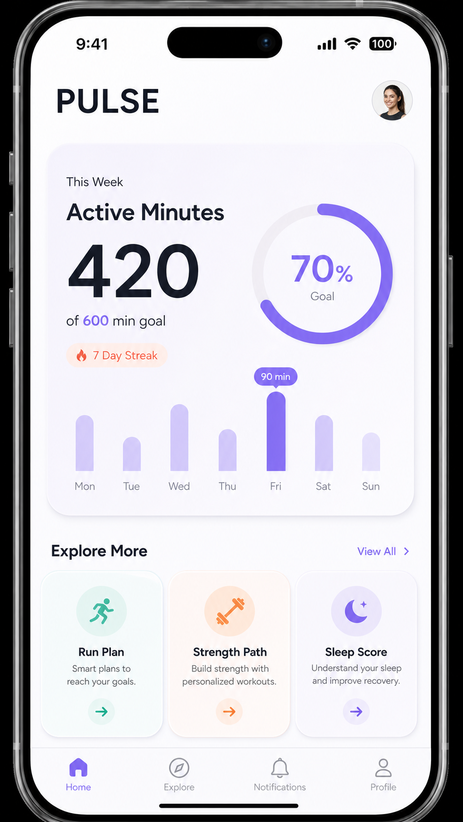
The essence of a mobile mockup is a phone frame + a clear top-to-bottom block layout + a bottom tab bar. Pin down each block and the color scheme.
Design a high-fidelity mobile app screen mockup, portrait 9:16, shown inside a modern smartphone frame.

App: a habit-tracking app home screen.
Layout: top greeting and date, a weekly streak ring, a scrollable list of today's habits with checkboxes and progress bars, a bottom tab bar (Home, Stats, Add, Profile).
Style: clean minimal iOS-style UI, soft rounded cards, generous whitespace, a calm mint-and-charcoal color scheme, legible sans-serif type, subtle shadows.
Make all labels real, readable English text — not lorem ipsum.
👉 Use this template: Remix the mobile app screen
Ready-to-use templates: Mobile App Fitness UI, Daybreak To-do App, Meditation App Screen, and Nesting Onboarding Screen. Pick 9:16 and 2K.
Direction B — SaaS dashboard / web app
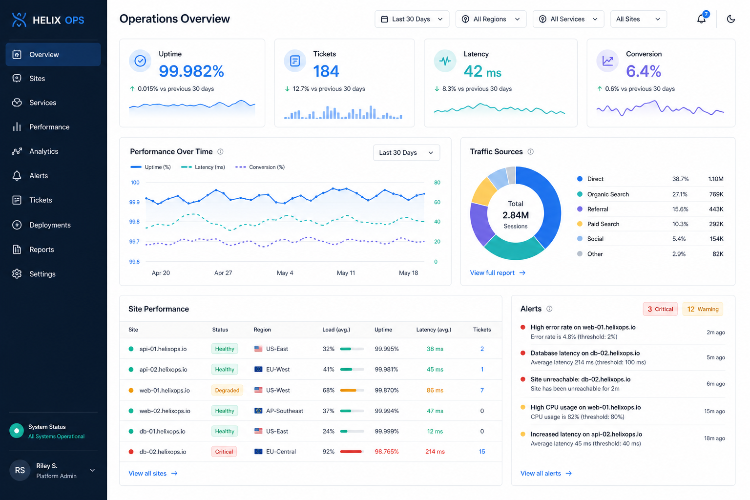
For a web app, the key is sidebar + top bar + KPI cards + charts + table — the classic admin layout. Spell out each region and demand a clear typographic hierarchy.
Design a high-fidelity SaaS web dashboard mockup, 16:9, desktop browser view.

Product: an analytics dashboard for a subscription business.
Layout: left sidebar navigation with icons, a top bar with search and user avatar, KPI stat cards (MRR, active users, churn, growth), a large line chart, a bar chart, and a recent-activity table.
Style: modern clean admin UI, light theme with one indigo accent color, rounded cards, clear typographic hierarchy, real readable labels and plausible numbers.
👉 Use this template: Remix the SaaS dashboard
Reference templates: Desktop Operations Dashboard, Crypto Wallet Dashboard, Smart Home Tablet Dashboard, and Product Detail Page UI. Pick 16:9 and 2K.
Direction C — Landing-page hero section
For a marketing site, the key is nav bar + headline + subhead + call-to-action + product visual + logo strip. Ask for real, punchy copy so the section reads like a finished page.
Design a modern SaaS landing-page hero section mockup, 16:9, desktop web view.

Product: a project-management tool.
Layout: top navigation bar with logo and menu, a bold headline and one-line subhead on the left, a primary and secondary call-to-action button, and a product screenshot or abstract illustration on the right, with a trusted-by logo strip below.
Style: clean contemporary web design, lots of whitespace, one vivid accent color on a light background, crisp sans-serif type, real readable copy.
👉 Use this template: Remix the landing-page hero
Reference templates: Travel Hero Section, SaaS Hero Background Analytics, and Website UI Modernization Redesign.

Direction D — App Store screenshot set and empty states
Two high-value edge cases that are easy to forget:
- App Store screenshot set: a row of phone frames, each with a big benefit headline above the screen — exactly what stores require. See App Store Screenshot Set;
- Empty states: the "no results / first-run / upgrade" screens that make or break polish. See Empty State — No Results and SaaS Dashboard Empty State Upgrade.
Export to the right sizes
Once the mockup looks right, resize it to where it will live:
- Fine-tune framing: use the Image Cropper to trim to the exact aspect ratio you need;
- Hit platform specs: use the Image Resizer to output App Store screenshot sizes, a deck-friendly 1920×1080, or a specific web asset size;
- Assemble a set: use the Photo Collage tool to line several screens up into one presentation board.
Generate another, or use "Use as reference" for fixes
- Layout not quite right? Click Generate another to reroll the same prompt;
- One block off, or garbled text? Click Use as reference and add "redo only the [top bar / chart], keep the rest unchanged";
- Want a dark theme or a different accent color? Click Use as reference and add that to the prompt.
Tip: pick
2Kor higher so small UI text stays legible. GPT-Image-2 produces a static image of a UI — perfect for concepts, pitches, and reviews, but not a coded interface. Treat it as a fast, high-fidelity mockup.
Wrap-up
UI mockups come down to two things:
- On image-2.net, lay down the "UI spec" prompt, then swap layout and style by screen type;
- Click Generate another or use Use as reference to fix a single block, then resize for its destination.
Save the closest template, swap in your product and layout each time, and you can validate a UI direction in minutes instead of hours.