Event posters, social covers, promo banners, video thumbnails — they look simple, but doing them yourself is a slog: you need a photo editor, layout sense, and stock assets. A designer takes time to schedule; outsourcing costs money.
There's a much simpler approach now: write the layout, copy, palette, and style into one prompt and let GPT-Image-2 generate a poster with headline text in one shot. In about half a minute you get something ready to post. Text coming out wrong? This post gives two reliable fixes.
This tutorial uses GPT-Image-2 for the full flow from "brief" to "poster" — no design software. For printing or a sharp large image, set the resolution to 2K or 4K.
Why use GPT-Image-2 for posters
- Visual and text together: hero visual, headline, subhead, and palette all laid out at once — no find-an-image-then-lay-out-separately;
- Change a line to change the copy: swap the headline in the prompt, regenerate, and you have a new poster — fast iteration;
- Free-form layout: vertical poster, horizontal banner, square social cover, 16:9 video thumbnail — just change the ratio.
Step 1 — Decide the layout and ratio
First, think about where it'll be posted and what ratio it needs:
- Promo / event poster: vertical
4:5or9:16; - Social cover: square
1:1, safest in feeds; - Video / YouTube thumbnail: horizontal
16:9, high-contrast, eye-catching.
Open https://image-2.net/ and pick the matching ratio.
Step 2 — Write the "render text" poster prompt (the main example)
A good poster prompt comes down to four things: describe the hero visual + pin the exact text verbatim + specify the typographic hierarchy + lock the palette and style.
💡 Lazy version: click one-click this prompt to auto-fill the prompt, ratio, and resolution. To adapt it to your own campaign, read on.
Paste the prompt below and swap in your own copy:
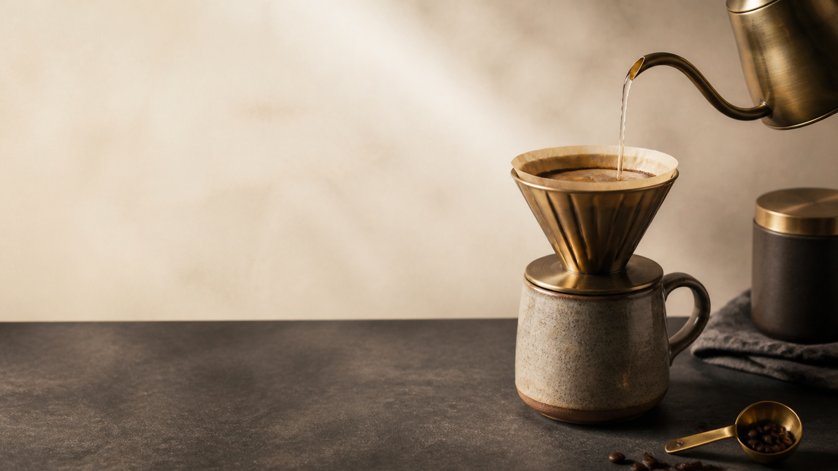
Design a vertical promo poster (4:5) for an autumn pour-over coffee launch.
- Hero visual: a steaming cup of pour-over coffee on a wooden table, warm tones, premium commercial photography;
- Top headline (verbatim, spelled correctly): "AUTUMN POUR-OVER SEASON"
- Subhead: "NEW ARRIVAL · 2ND CUP 50% OFF"
- Small line at the bottom: "NOW THROUGH NOV 30 · IN-STORE ONLY"
- Clear typographic hierarchy, generous negative space, palette of warm cream + deep espresso + a touch of caramel gold, sharp readable centered text.
Key points:
- Always write the text verbatim, in quotes: the model renders what's inside your quotes; say "write a promo tagline" vaguely and it improvises;
- Mark the hierarchy (headline / subhead / fine print) so the model gets the size order right;
- Lock the palette: give 2–3 colors so the image stays cohesive;
- Choose
2K, or4Kfor print, then Generate (~40s).
Step 3 — Three common layout variants
Scenario A: Promo / event poster (vertical)
The focus is an eye-catching headline + complete key info (date, offer, CTA). Use the main template and swap in your headline, offer, and date. Add a CTA with:
Add a button-style call to action at the bottom: "SHOP NOW", caramel-gold fill with deep espresso text.Scenario B: Social cover (square)
In a feed it has to be instantly clear and sharp even small. Focus on one strong hero visual plus a short headline:
Design a square (1:1) social media cover for a new productivity feature launch.
Center a bold visual metaphor (e.g. an origami time-machine releasing a stream of glowing tasks).
A short headline at the top (verbatim): "STAY AHEAD OF EVERY DEADLINE".
Modern, scroll-stopping, legible at small size, high contrast, clean background.
👉 Use this template: Remix the square social cover

Scenario C: Video / YouTube thumbnail (horizontal)
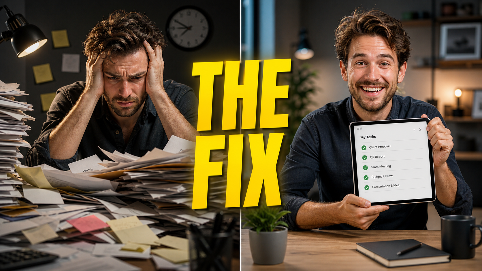
A thumbnail needs high contrast, expressive faces, big text. A before/after split is the go-to formula:
Design a 16:9 video thumbnail. Left: a person frustrated at a messy pile of papers;
Right: the same person smiling with a clean tablet. High contrast, expressive faces.
A bright yellow text overlay in the center (verbatim): "THE FIX".
👉 Use this template: Remix the video thumbnail
Text coming out wrong? Two more reliable approaches
AI text rendering sometimes drops strokes or scrambles characters, especially long lines. Two fixes:
Approach 1: make text easier to render
- Less text: keep headlines short, don't cram a screen full;
- Quote it verbatim and stress "text spelled correctly, sharp and legible";
- Bump resolution to
4Kfor crisper letter edges; - Re-roll with Generate again if it's off — a couple of tries usually lands it.
Approach 2: generate a "copy-space background", then set type with a tool (most reliable, 100% accurate text)
Delete the text from the prompt and replace it with "leave a clean negative-space area for the headline, do not render any text", generate a clean background, then use the Text on Image tool to place the headline and subhead precisely. The text will be exactly right — font, position, and color all under your control.
Step 4 — Build a set (multi-image layouts)
Campaigns usually need a set. Generate a few hero visuals with the same style prompt, then use the Photo Collage tool to combine them into a series long-image or grid — consistent style, easy to publish.
Re-roll, or use "Continue editing" for local fixes
- Off overall? Same prompt, Generate again for a fresh seed;
- Just one wrong character or off color? Continue editing: "Only make the headline text clear; keep everything else unchanged";
- Want a different palette or an added element? Add it in Continue editing.
Tip: get the layout and hero visual right first, then fuss over text details — more reliable than demanding everything at once.
Wrap-up
A marketing poster really comes down to three things:
- On image-2.net, pick the ratio and generate in one shot with a "hero visual + verbatim copy + hierarchy + palette" prompt;
- Apply the promo poster / social cover / video thumbnail variant for your use;
- For 100% accurate text, generate a copy-space background and set type with the text tool; for a set, combine with the collage tool.
Save the prompt template and just change the copy and hero visual to reuse it. A few directions worth trying:
- Campaign sets: same palette and layout, batch out teaser / launch / encore versions;
- Seasonal hooks: swap the background to a holiday mood in "Continue editing" for quick timely posters;
- A/B thumbnails: generate several headline and visual variants and pick the highest click-through.
One caveat: rendered text can have small flaws. Before publishing, proofread key info — headline, prices, dates — character by character, and re-set type with the text tool if needed.