
An infographic is one of the most shareable formats on social: take a concept, a dataset, or a process and turn it into a clean, instantly-readable image, and it spreads far better than plain text. But making one yourself isn't trivial — you need design software, layout sense, and icons.
There's a much simpler approach now: write the content as a structured prompt and let GPT-Image-2 generate a well-laid-out, consistently-iconed, clearly-labeled infographic in one shot. In about half a minute you get something ready to post.
This tutorial uses GPT-Image-2 for the full flow from "organize the content" to "ship the infographic" — no design software. For printing or a sharp large image, set the resolution to 2K or 4K.
Why use GPT-Image-2 for infographics
- Structured content is its strength: steps, comparisons, data — spell out the structure and the model lays out a clean composition;
- Icons and text in one pass: no hunting for icons or nudging alignment — visual and captions are arranged together;
- Change content by changing the prompt: new topic or new dataset, regenerate, new graphic.
Step 1 — Structure the content first
Before writing the prompt, decide which structure your content fits — that determines what the infographic looks like:
- Process / step: an N-step guide (e.g. "4 steps to better pour-over coffee");
- Comparison: a Vs of two options (e.g. "old vs new tech");
- Data story: a few key numbers telling a trend (e.g. "the rise of remote work");
- Explainer diagram: a labeled cross-section / structure (e.g. "volcanic eruption cross-section").
Decide which it is, then write the matching prompt.
Step 2 — Write the infographic prompt (process type as the main example)
A good infographic prompt comes down to three things: state the structure (how many parts, how arranged) + pin every label verbatim + a consistent icon style with legible text.
💡 Lazy version: click one-click this prompt to auto-fill the prompt, ratio, and resolution. To adapt it to your content, read on.
Paste the prompt below and swap in your topic and labels:
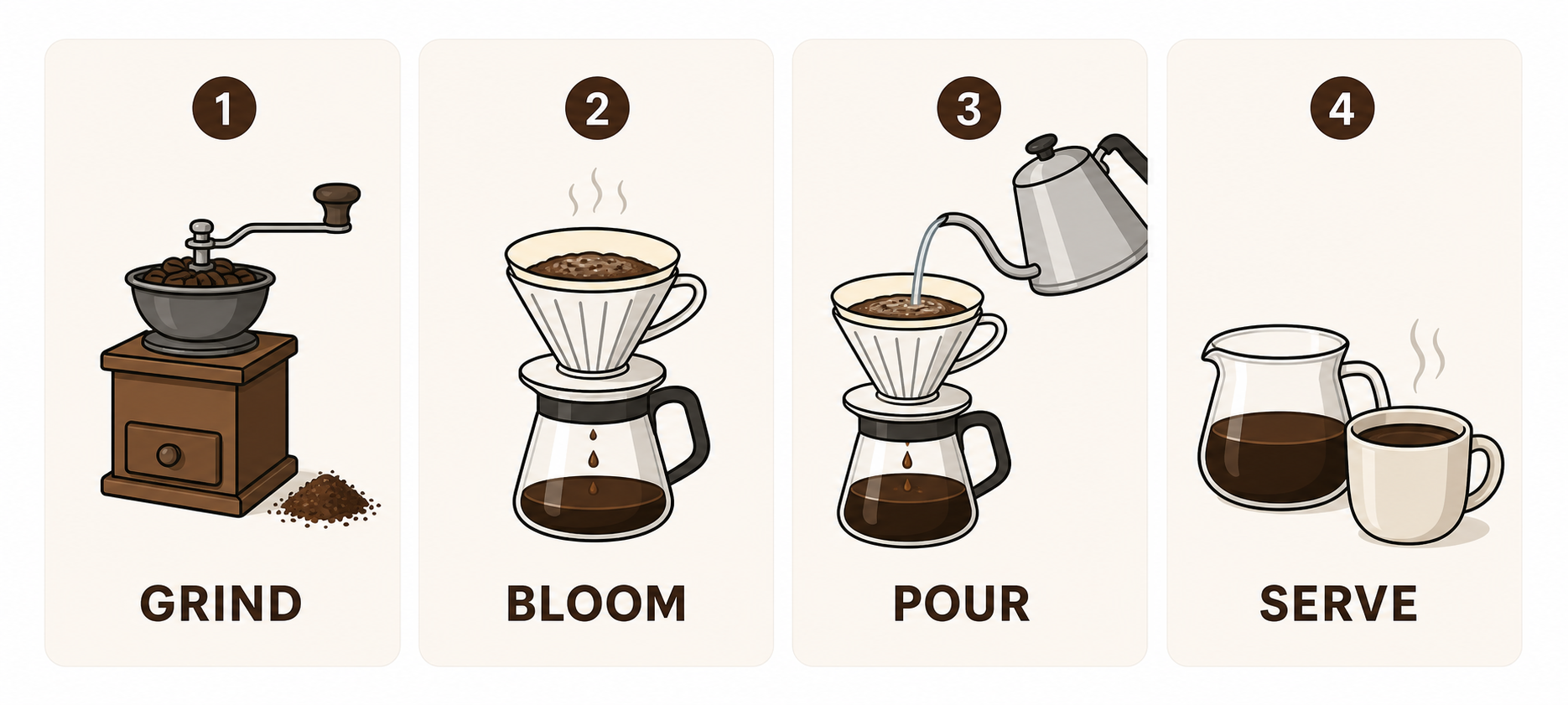
Create a horizontal (16:9) process infographic titled "4 Steps to Better Pour-Over Coffee".
Split it into four equal panels, each with one clean flat icon and a short label.
Labels must be exactly, spelled correctly: "GRIND", "BLOOM", "POUR", "SERVE".
Flat vector style, a consistent soft palette, clean layout, sharp readable text.
Do not add extra text or invent any content.
Key points:
- Quote every label verbatim: the model renders what's in the quotes; say "write some step names" and it makes things up;
- Pin the count and layout (e.g. "four equal panels") or it arranges them randomly;
- A consistent icon style + palette keeps the composition tidy;
- Add "do not invent any content" to stop the model adding fake numbers or text;
- Choose
2K, or4Kfor print, then Generate (~40s).
Step 3 — Four common infographic types
Type A: Process / step
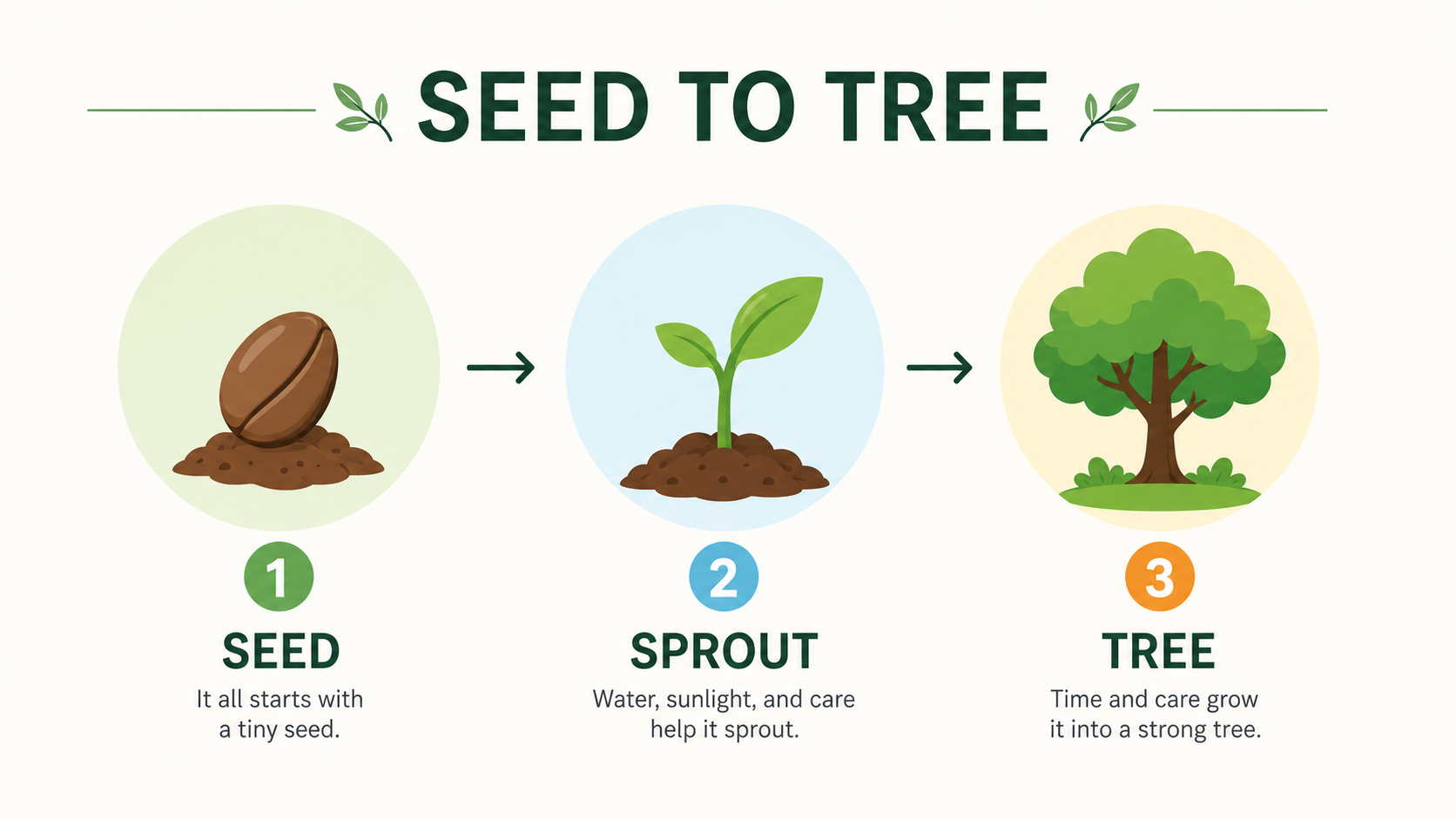
An N-step guide is the most common. Besides the four-panel layout, you can do a vertical step flow — the focus is always verbatim labels + a consistent icon style:
Create a 3-step process infographic titled "Seed to Tree".
Three stages: 1. Seed, 2. Sprout, 3. Tree, with simple flat vector icons and a soft muted palette.
The number and title for each stage spelled correctly, verbatim, and legible.
👉 Use this template: Remix the Seed-to-Tree infographic
Type B: Comparison (Vs)
Great for "old vs new / pros and cons / option A vs B". The focus is two columns, strong contrast:
Create a "Vs" comparison infographic.
Left column: "OLD TECH" with a chunky grey CRT monitor;
Right column: "NEW TECH" with a thin holographic screen.
High contrast, clean layout, both labels verbatim and legible.
👉 Use this template: Remix the Old vs New comparison

Type C: Data story
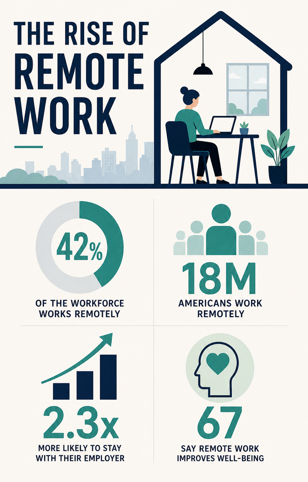
A few key numbers telling a trend. The critical rule: use only the numbers you give, forbid the model from inventing more:
Create a data-story infographic about the rise of remote work.
Use symbolic shapes, charts, and visual hierarchy, including only these numbers: 42%, 18M, 2.3x, 67.
Clear spacing, high contrast, restrained colors, readable labels.
Do not invent any extra statistics or text.
👉 Use this template: Remix the remote-work data story
Type D: Explainer diagram / cross-section
Great for educational explainers and product breakdowns. The focus is a labeled structure diagram:
Create a cross-section diagram of a volcanic eruption, scientific illustration style.
Clearly label these parts (verbatim, black sans-serif): "Magma Chamber", "Main Vent", "Ash Cloud".
Clear label lines, clean and readable overall.
👉 Use this template: Remix the volcano cross-section
When text / labels come out wrong
The labels are where infographics most often break, especially long words. Two fixes:
- Approach 1: make text easier to render — keep labels short, quote them verbatim, bump to
4K, and re-roll with Generate again if it's off; - Approach 2: generate a "label-free" version, then add text — ask the prompt for "icons and layout only, leave label areas blank, do not render text", then place labels precisely with the Text on Image tool for 100% accurate text.
Step 4 — Slice a long / multi-card graphic for social
Infographics often go on social feeds. If you made a multi-panel long image (e.g. a 3×2 set of knowledge cards), use the Image Splitter to auto-cut it along the dividing lines into separate images for individual upload — consistent style, more feed real estate.
Tip: to make it easy to slice, add "use pure black dividing lines between cells" to the prompt so the tool can auto-detect the grid and cut instantly.
Re-roll, or use "Continue editing" for local fixes
- Layout off overall? Same prompt, Generate again for a fresh seed;
- Just one wrong label? Continue editing: "Only change the label in panel 3 to 'POUR'; keep everything else unchanged";
- Want a different palette or icon style? Add it in Continue editing.
Tip: with infographics, restraint wins. One topic and one structure per image is clearer — and easier to generate — than cramming everything in.
Wrap-up
Making an infographic really comes down to three things:
- Structure the content first (process / comparison / data / diagram), then on image-2.net generate in one shot with a "structure + verbatim labels + consistent icons" prompt;
- Apply the process / comparison / data / diagram type for your content;
- For 100% accurate labels, generate a label-free version and add text; for social, slice into single images with the splitter.
Save the prompt template and just change the topic and labels to reuse it. A few directions worth trying:
- Knowledge-card series: same palette and layout, batch out a series of explainers;
- Weekly data: drop each week's numbers into the data-story template for quick visuals;
- Product explainers: use cross-section diagrams to show product features more clearly than text.
One caveat: rendered text and numbers can have small flaws. Before publishing, proofread labels and data character by character, and re-set key numbers with the text tool to be safe.